Previously on this blog: Making a font with 9,999 ligatures to display thirteenth-century monk numerals.
As the title implies, I have been baited into creating another cursed font. Check out the demo here: Jamaican Alphabet Font.
This one extends the Jamaican flag:
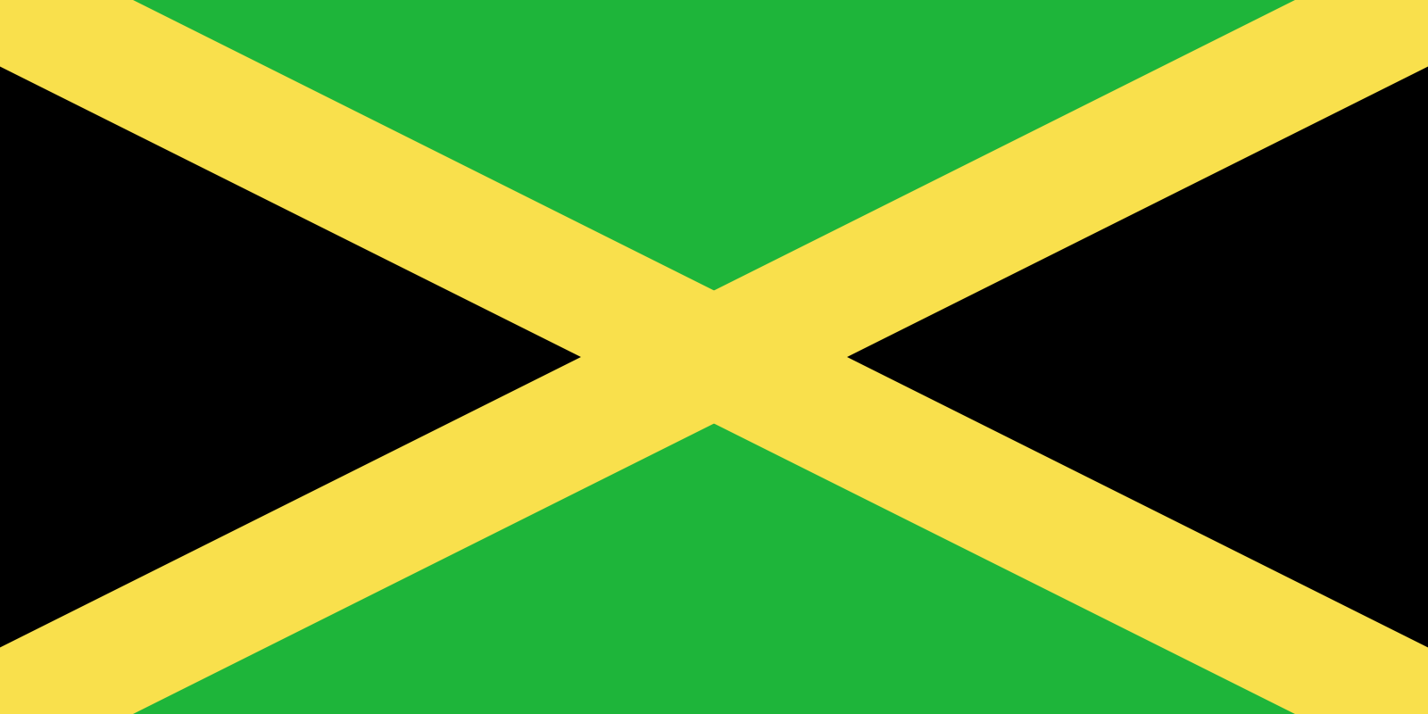
This flag has a certain “X”-factor.
Into the full alphabet, as a usable font:
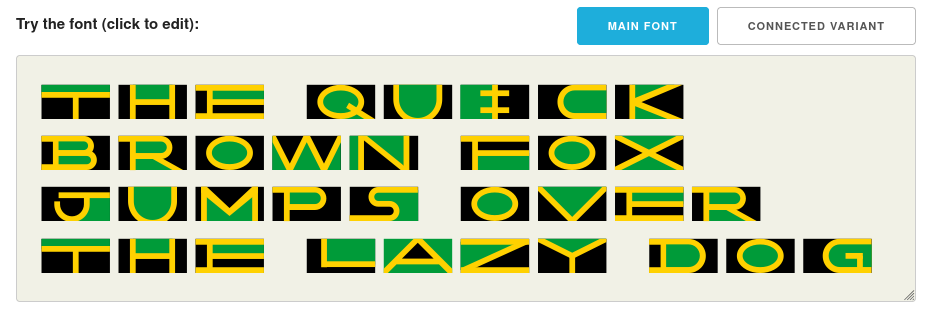
This font is based on the design from this Reddit post from u/VelvetOnion.
But the approach is rather different from my previous Cistercian font project. Instead of (ab)using ligatures, this one is more of a traditional font implementation.
How is font/typeface design supposed to work? I have no idea how it’s supposed to go… but I will tell you about what I did.
Drawing shapes with colors. In a font!
Of course font files contain the shapes of each letter - that’s obvious. But did you know they can also contain colors with COLR/CPAL? I picked the colors and aspect ratio of the real flag, twice as wide as it is tall, and got to drawing (in code):
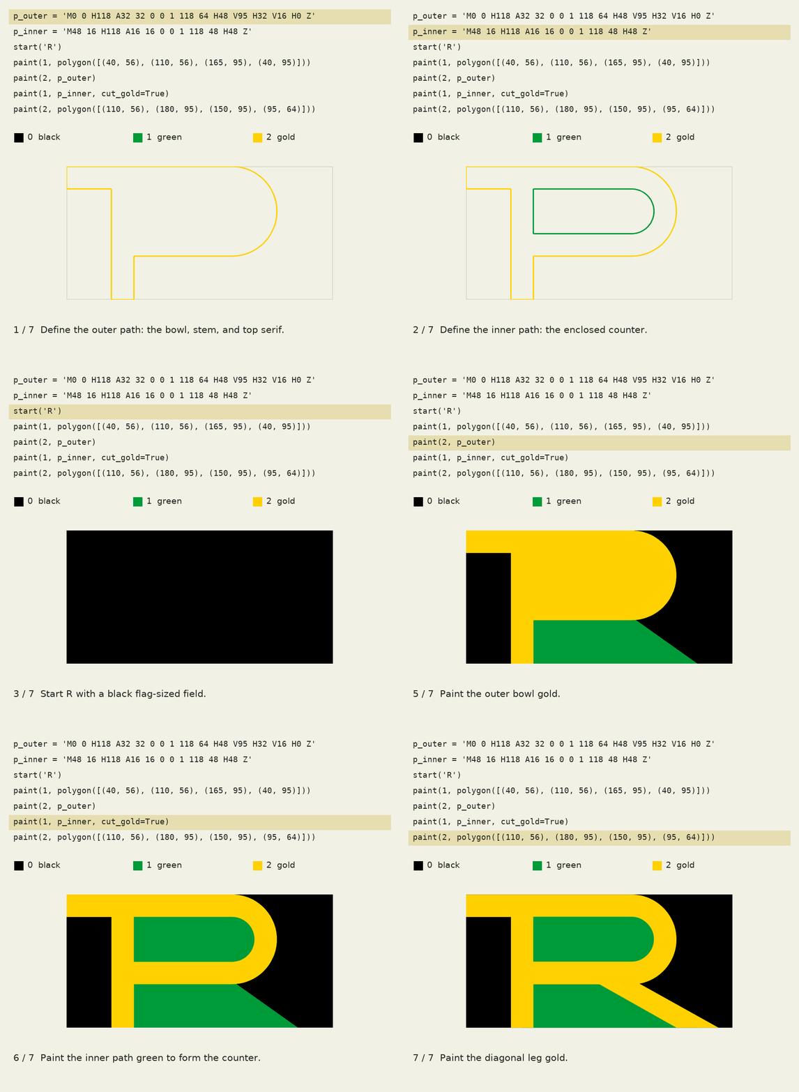
Blammo. We’re off to the races, and the main Jamaican Alphabet does exactly this based on the original drawing from u/VelvetOnion.
But there was an intriguing idea in the comments, too:
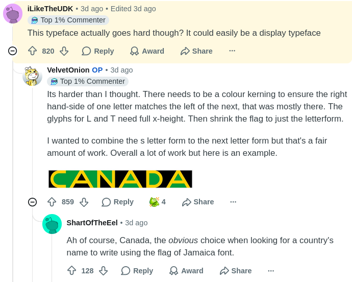
This is where it gets interesting. Can we create a font like that?
Spoiler alert: yes. This is what mine looks like:

Here’s how it works.
Combining prep: reshaping letters
I really liked the idea of combining the letter S with other letters in a cursive-y way. As Dave Addey has written, this is a tried and true way of making a font futuristic:

Look at those connectimabobs on the UTU!
But why should only the letter S have all the fun? Let’s adjust I, J, L, and T so they’ve got convenient connecting points at the corners:
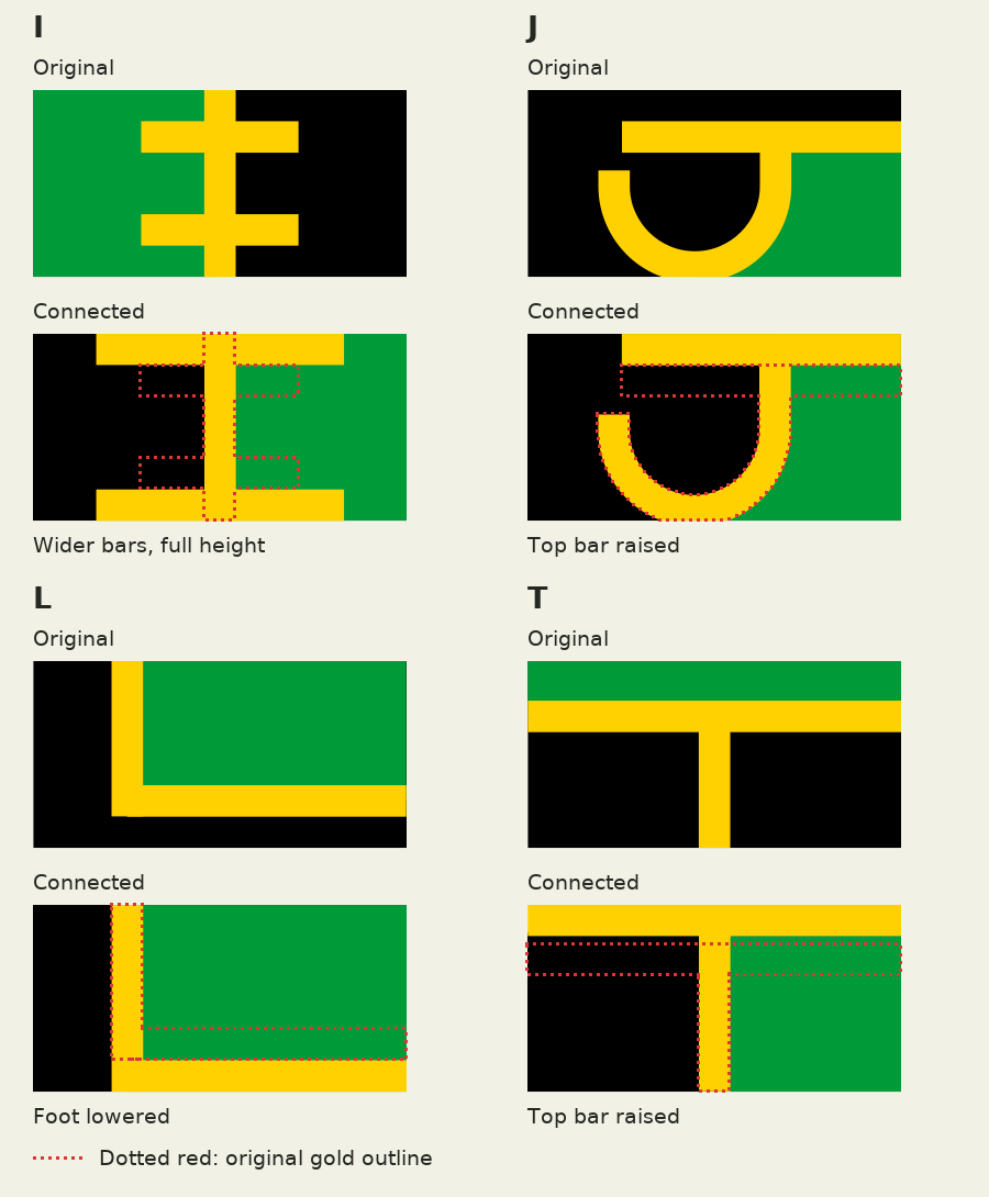
Combining prep 2: matching up background colors
Now, we need to make sure the background colors match between adjacent letters. If the right side of a letter is green, the following letter’s left side should also be green; and vice versa, with black.
If you read the Cistercian font post, you might expect ligatures will come back.
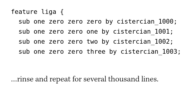
(Last time, the font was just 9,999 of these bad boys.)
But that only worked because there’s a fixed number of Cistercian numerals (9,999). This time, I want matching background colors over an arbitrarily-long sequence. The aptly named contextual alternates feature is a perfect fit.
A bit of background first: in fonts, a character is the concept of a letter; a glyph is the shape the font uses to draw it. We can define multiple glyphs that represent the same character, then choose between them based on the other characters in the sequence.
Now for our Jamaican Connected font, let’s define two glyph forms for each letter, black -> green and green -> black.
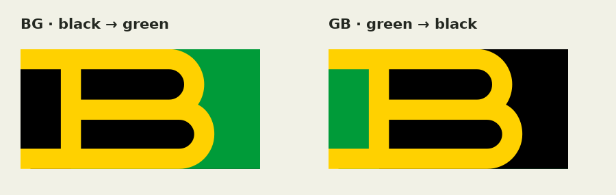
After doing this for every letter and defining a few glyph classes, we can now write a simple contextual alternates rule that defines how to draw adjacent characters so that their color form alternates.
@startBlack = [A.BG B.BG C.BG ...] // ...all continue to Z
@startGreen = [A.GB B.GB C.GB ...] //
@endBlack   = [A.GB B.GB C.GB ...] //
@endGreen   = [A.BG B.BG C.BG ...] //

feature calt {
  lookup ColorChain {
    sub @endGreen @startBlack' by @startGreen;
  } ColorChain;
} calt
This ColorChain rule defines a substitution rule: when we see an @endGreen glyph followed by a @startBlack glyph, we should replace the @startBlack glyph with the corresponding @startGreen glyph.
(The apostrophe ' in @startBlack' indicates that it should be the one substituted, and there’s no definition for the reverse substitution because the default is to start with `startBlack`).
Aren’t startBlack and endGreen the same glyphs? Not quite. Along the way I realized a couple letters don’t have color-changing forms: W and X.
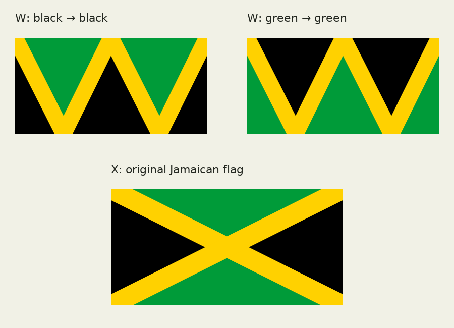
W has enough sections that it returns to the starting color, so it gets BB and GG versions instead. X is the original flag design, so I wanted to keep it. Yes, technically this means that X can break the color matching.
Here’s what it looks like, before and after turning on the contextual alternates:
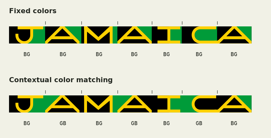
Sorry I didn’t make a CANADA version of this one.
Doing the combining!
Now we can put it all together. The obvious connection points are at the corners, so let’s make letters connect if they both extend into the same (adjacent) corner:
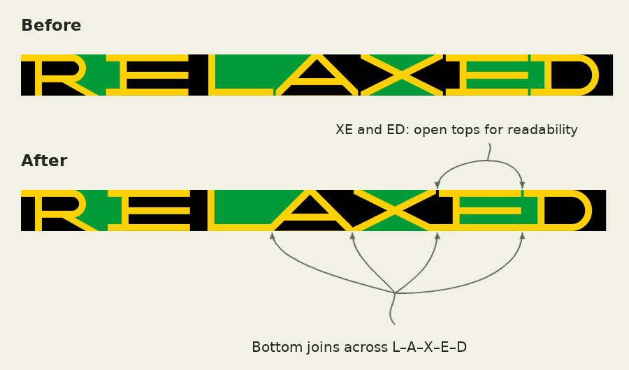
Again, contextual alternates are used to define new glyph forms that overlap each other. For example, this contextual rule for ED selects a new D form containing the extra gold bit:
calt {
  sub @corner_out_ED @corner_in_ED' by @corner_joined_ED;
} calt
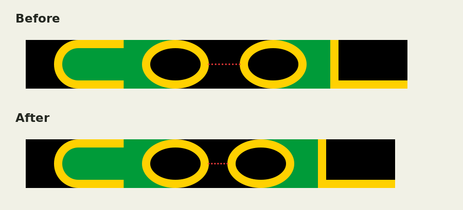
And we can use `kern` rules to adjust kerning, the spacing between each pair of letters. This rule reduces the space between consecutive Os by 120 units:
kern {
  pos @kern_O @kern_O -120;
} kern
And the result looks like this:
All of this happens within the font
Looking at the final demo site with the eyes of a developer (though it’s been years since anyone’s paid me to do frontend work), it’s easy to imagine a big old pile of JavaScript behind it.
But it's all contained in the font, using standard OpenType features. The final Jamaican Connected font contains 2,622 glyphs (all of these letter pairs add up!) and 865 rules defining how they’re used.
I’m not a typography person (as I say, with a second font blog post), so I’m sure there is room to improve. This was a quick and iterative process with my eyeballs and a Codex window, and all the code is available on my GitHub: bobbiec/jamaican-flag-fonts . If you have suggestions, please let me know at bobbie@digitalseams.com!
And an exercise left for the reader:
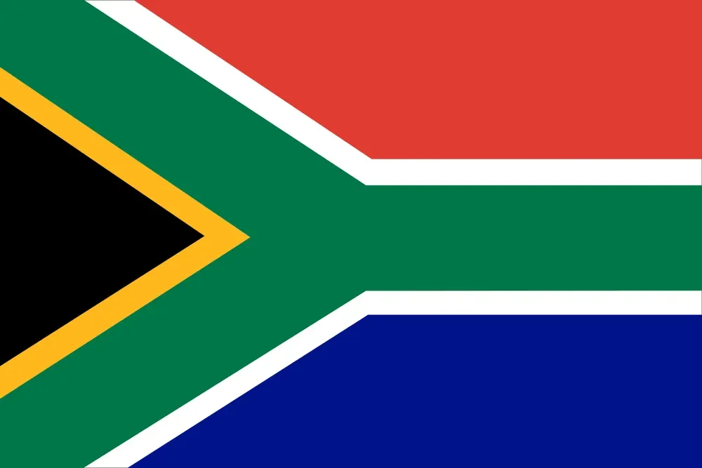
The flag of South Africa sure looks like a rotated Y, doesn’t it? ',:^)