Making a font with 9,999 ligatures to display thirteenth-century monk numerals
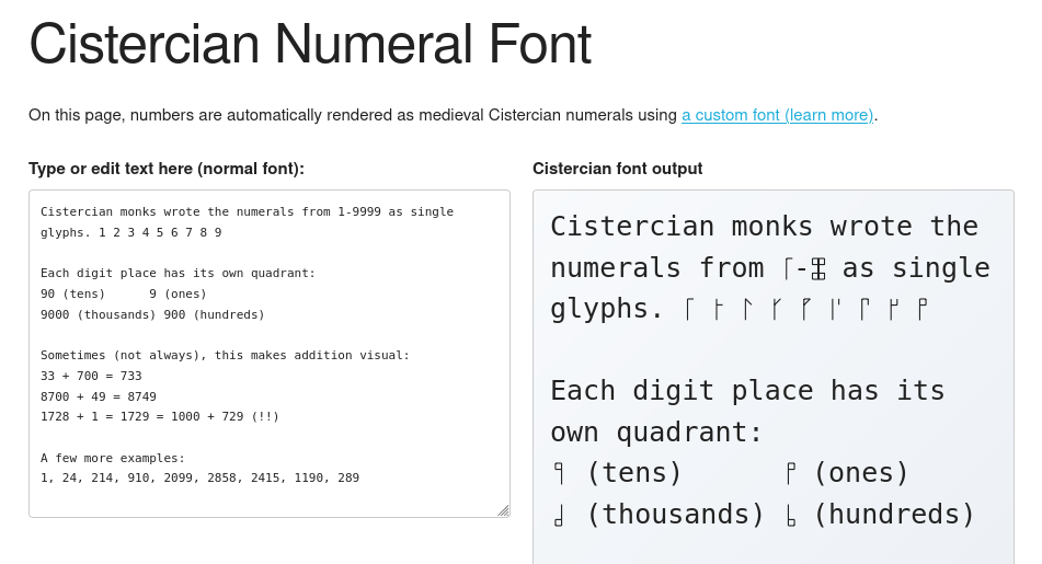
As the title implies, I just created a font that displays numbers in a compact format used by Cistercian monks. You can play with it on my demo site here:
This project was inspired by Chris Heilmann’s post about creating a generator for Cistercian numerals. His version creates PNG and SVG images, but I had the thought - why not use font ligatures instead?
Font ligatures are fun and useful
Font ligatures are a feature of digital typefaces, typically used to fix issues with certain combinations of letters. For example, overhanging “f” might collide with a following “i” or “l”; font creators can set a ligature that replaces the ugly collision with a prettier glyph.
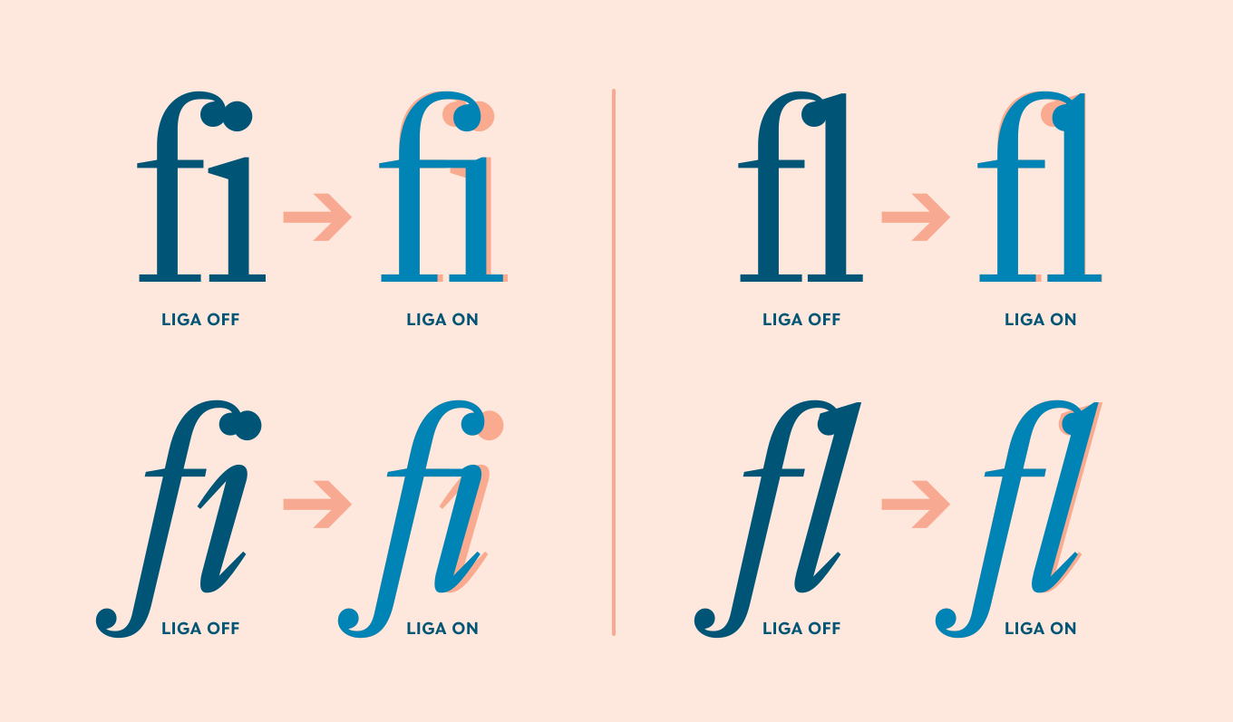
Image via Type Network: OpenType at Work | Standard Ligatures
Some fonts designed for programming, like Fira Code, will use (abuse?) ligatures to combine sequences used for programming (like !== or =>) into their own glyphs.
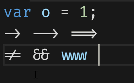
Animation via Scott Hanselman: Monospaced Programming Fonts With Ligatures
The neat thing about ligatures is that they are a visual enhancement of the underlying characters. That means that you can Ctrl-F to find them by the numbers, copy-paste them, and even type them live and see them change - without any JavaScript, just a special font.
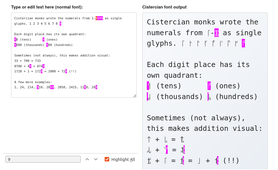
Searching for “9” highlights the corresponding Cistercian numerals. Notice that it’s possible for partial glyphs to be highlighted here, and indeed you can select 1/4th of a glyph to copy just one digit.
This means that by replacing your default fonts on your browser, you can get Cistercian numerals everywhere! Why would you want to do that? Anyways…
Creating the font
Defining a ligature is very straightforward: you list the sequence of characters to replace, and then the glyph to replace them with. The ligature definition for the custom font literally looks like this:
feature liga {
  sub one zero zero zero by cistercian_1000;
  sub one zero zero one by cistercian_1001;
  sub one zero zero two by cistercian_1002;
  sub one zero zero three by cistercian_1003;
…rinse and repeat for several thousand lines.
The “sub” sequence of characters matches greedily, which is why this list starts with 4-digit numbers; if it started from 1 to 9, then we’d just get a bunch of single-digit replacements. That also means that for 5+ digit numbers like 123456, the font will match 4 digits at a time and produce the glyph for “1234”, then “56”.
The glyph appearance itself is defined using the SVG paths from Chris Heilmann’s Cistercian numeral generator. Thanks Chris!
For the full code I used to generate the Cistercian font, see the GitHub repo: bobbiec/cistercian-font. Note that the code is largely AI-generated - though I reviewed it, I also wouldn’t have the expertise to notice if something is very wrong.
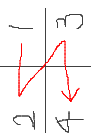
Middle-endian quadrants?
Something I noticed when playing around with the demo is that the quadrants are ordered in a rather unusual way. If you count from the least significant digit (ones) to the most significant digit (thousands), you get this backwards-Z shape:
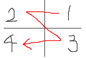
Image via my ugly drawings
I would’ve expected the natural left-to-right writing order (as Cistercian monks are Italian), or perhaps one that rotates across one axis at a time (like the traditional Cartesian quadrant naming, which goes counter-clockwise).
But then, the Wikipedia page mentions that “A horizontal stave was most common” in the original 13th-century usage, and the vertical stave was only introduced later. In the horizontal position, we get a far more natural writing order: the backwords-N shape, or “left column followed by right column”.
That being said, it’s still the reverse endianness of our modern Arabic numerals: in Cistercian numerals, the least significant bit comes “first” (visually, at the upper left), while in Arabic numerals the most significant bit comes first.
—
But all this to play with font features. Once you realize that fonts can arbitrarily re-visualize text while preserving its machine-readable form, it’s hard not to see the potential for trickery. There aren’t a lot of legitimate reasons to do this (for one thing, big differences are an instant accessibility problem), but plenty of nefarious ones. Watch out!
And left as an exercise to the reader: the “Cloud to Butt” browser extension, but implemented with font ligatures.